The Complete Guide to Browser Frames for Screenshots
Browser frames add context and polish to your screenshots. But which frame should you use? The right choice depends on your content, audience, and platform.
Why Browser Frames Matter
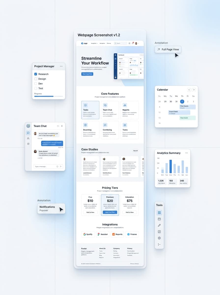
When you share a screenshot of a website or web application, adding a browser frame provides immediate context. The reader instantly understands they're looking at a webpage, a desktop app, or a specific operating system interface.
Frame Styles Explained
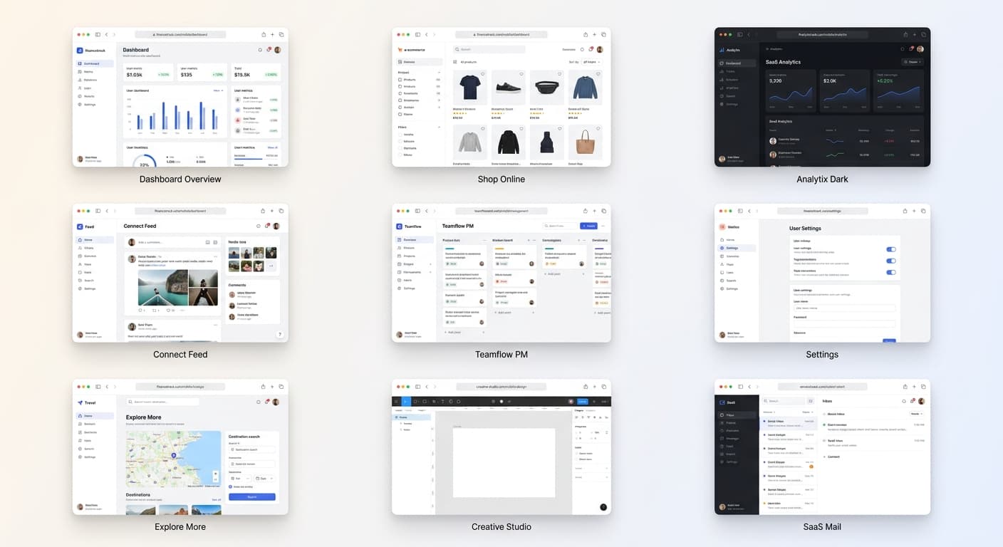
macOS Frame
The classic choice for web apps and SaaS products. The distinctive "traffic light" buttons (red, yellow, green) are instantly recognizable and convey a premium feel.
Best for: Landing pages, web applications, dashboard screenshots, modern tech products
Windows Frame
Great for enterprise software and B2B products. The minimize, maximize, and close buttons are familiar to corporate audiences.
Best for: Business software, productivity tools, enterprise dashboards, B2B marketing
Chrome/Browser Frame
A neutral choice that focuses on the web context without platform-specific styling.
Best for: Web-based tools, browser extensions, cross-platform applications
Minimal Frame
Clean and modern. A simple title bar or thin border that keeps all attention on your content without distraction.
Best for: Mobile-first designs, content-heavy sites, documentation, UI components
Frame Selection Best Practices
Stay Consistent Across a Project
If you're creating a series of screenshots for documentation, a blog post, or a presentation, use the same frame style throughout.
Match the Frame to Your Platform
If you're showcasing a Mac app, use macOS frames. If you're demonstrating Windows software, use Windows frames.
The Bottom Line
Browser frames are more than decoration—they're context. The right frame helps viewers immediately understand what they're looking at and signals professionalism.