Screenshot Annotation Best Practices for Clear Communication
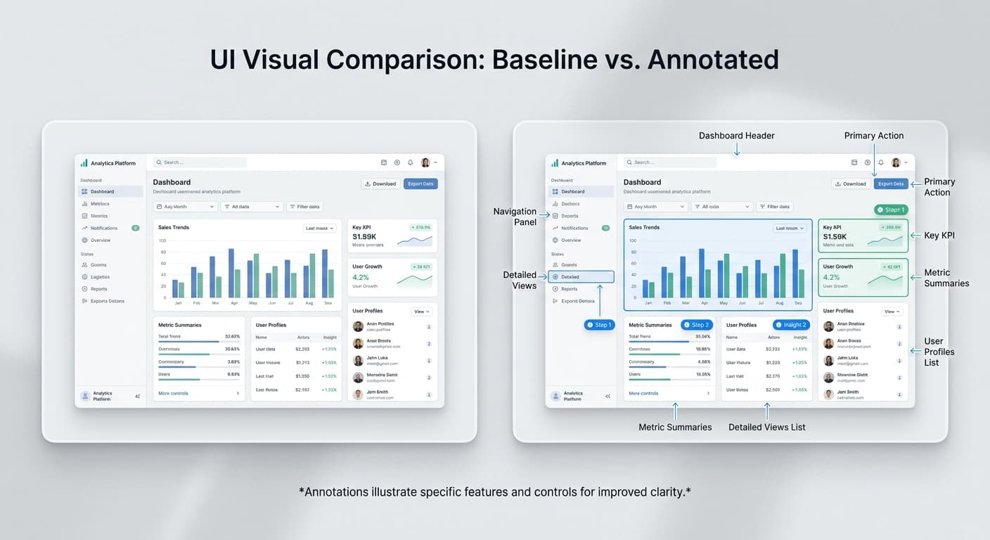
Annotations transform screenshots from static images into instructional guides. But poor annotation creates confusion. Here's how to annotate effectively.
Why Annotations Matter
A screenshot without context requires interpretation. Annotations eliminate ambiguity by directing attention to specific elements and explaining their purpose.
Good annotations: - Guide the viewer's eye - Clarify complex interfaces - Reduce support questions - Speed up onboarding
Bad annotations: - Clutter the image - Use unclear labels - Overwhelm with too many callouts - Distract from the content
Types of Annotations
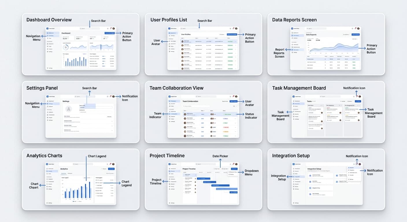
Arrows
Direct attention to specific UI elements.
When to use: Pointing to buttons, menu items, or interactive elements
Best practices: - Use solid arrows, not outlined - Point directly at the target element - Keep arrow length moderate (not too long or short) - Use consistent arrow style throughout
Numbered Callouts
Guide users through multi-step processes.
When to use: Sequential instructions, workflows, tutorials
Best practices: - Number steps in logical order - Place numbers near relevant elements - Use consistent circle size and color - Match numbers to written instructions
Text Labels
Explain unfamiliar terms or features.
When to use: Introducing new UI elements, defining terminology
Best practices: - Keep labels under 5 words - Use clear, simple language - Position labels near (not on) the element - Ensure text is readable at display size
Blur/Redaction
Hide sensitive information.
When to use: Protecting personal data, hiding confidential information
Best practices: - Use opaque blur (not semi-transparent) - Cover entire sensitive area - Don't rely on pixelation (can be reversed) - Verify nothing is visible through blur
Common Annotation Mistakes
Over-Annotating
Adding too many annotations creates visual chaos.
Problem: Five arrows, three text labels, and two highlight boxes on one screenshot
Solution: Break into multiple screenshots, each with one clear focus
Unclear Labels
Vague or wordy labels confuse rather than clarify.
Problem: "Click on this button here to proceed to the next step"
Solution: "Click Continue" or just a numbered callout
The Bottom Line
Effective annotation is about clarity, not decoration. Use the minimum annotations needed to convey your message. Choose the right tool for each situation. Stay consistent across your content.